Seabreeze Students: Sept. 28 - Nov. 21, 2021
Pop-Up Window Exhibit @ 9 West Granada Blvd, Ormond Beach
A selection of artwork created by students of Ms. Colby and Ms. Price at Seabreeze High School. Mediums include acrylic, colored pencil and mixed-media.
"Trophy Heads" by students of Ms. Colby
CLICK THE IMAGES BELOW TO READ THE ARTIST STATEMENTS
-
"Mother Roberta"
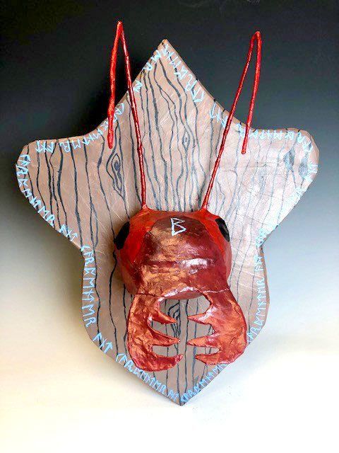
"My artwork is a mounted ant head with runes around it. The runes on the outside of the board say carpenter ant in old futhark, and the rune on its forehead means earth mother, which goes with the mother nature theme. The subject of my artwork is mother nature. The name of my work is Mother Roberta. The scale is most obvious in my work because it is a giant ant head. My artwork is paper mâché, metal, cardboard, and paint. Norse mythology inspired my work, and it stands for mother nature. My goal as an artist is become better at working with varied materials. Making this artwork helped me to reach my goal because I had never worked with paper mâché before making this artwork and it turned out very well. Something I learned that paper mâché glue smells disgusting, but this will influence my future pieces because now I know what to expect if I were to use this media again in the future." — J. Smythia, Grade 11
-
"Mystical Pixie"
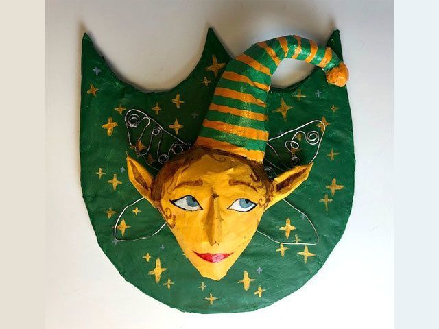
"My artwork is a trophy head of a mystical pixie. The Pixie head has blonde hair, blue eyes, and a green and orange hat with metal fairy wings. There’s a lot of patterns and the face is symmetrical. I used papier-mâché to make the head in to cover the cardboard backing. I used acrylic paint to paint the face, the hair, the backing, and the hat. I used metal wire and bent them into shapes of fairy wings and attached them to the sides of the head. I was inspired to do this artwork because my father has been teaching me about my Celtic background and surprisingly, I’ve learned a lot about pixies and fairies. The emotions I tried to show in this artwork was nostalgia by using earth tones and making the backing a more unique shape. My main goal and challenge was getting the fairy’s head a normal human-like shape and also being able to successfully use papier-mâché for the first time. During the process of making this project I learn how to work with cardboard, acrylic paint, and wires along with the papier-mâché. My artwork came out a lot better than expected." — Brianna B., Grade 11
-
"Glizzy the Glittering Dragonfly"
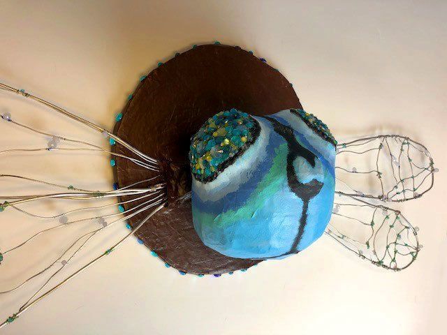
"My artwork is a glittering blue dragonfly. The dragonfly’s head is tacked up on a plaque to resemble a strange trophy head. His wings are hanging behind him. I titled my piece “Glizzy the Glittering Dragonfly”. Color and texture are the most prominent features on Glizzy. Her beaded wire wings and vivid blue sparkling eyes catch your attention first. I used paper mache to make Glizzy’s head, carboard and paper machete to make the plaque, wire and beads to make her wings, rhinestones and clay to make her eyes, and acrylic paint to add color and facial details. I used plyers to make and decorate her wings, and I used hot glue to fix the rhinestones to her eyes. Paper mache was the longest process in Glizzy’s construction, and the smelliest. My art teacher inspired my artwork with the idea of using insects to do this project. I immediately thought of making a dragonfly because I wanted to make wings, and I’m fond of how glittery dragonfly’s wings are. My artwork reminds me of summers in the sun, running after dragonflies in big fields with my brothers. It’s tranquil and joyful. My goals were to make a successful paper mache head, since it’s my least favorite media. I feel that my piece was successful in the execution and craftsmanship, but the paint portion of Glizzy was a challenge that I didn’t tackle as well as I had in making her. I learned that you won’t like every part of your sculpture, there will be parts you love and parts that irk you. I loved Glizzy’s eyes and wings but hated her paint. The piece is exactly how I pictured it in my head; the proportions, colors, and textures are perfect. This piece will influence my future pieces because it gives great examples of what I should work on and what I can use in other pieces that I’m good at." — Annabella K., Grade 11
-
"Agamania"
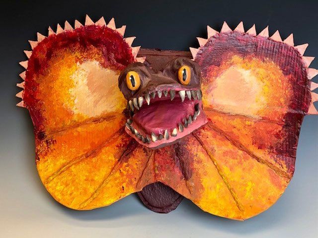
"My trophy head sculpture depicts the head of a frilled lizard with its mouth open mounted on a plaque, like taxidermy. The title of the piece is Agamania; “agama” is the family of lizard that the frilled lizard is a part of. The elements of art most prominent are color, texture and form, as there are bright warm colors used with a sponge texture. The sculpture takes up a great deal of space, and the protruding cardboard frills of the lizard contribute to its form. The principles of art most obvious are emphasis and balance, as the piece has bright, eye-catching hues and is symmetrical in shape. The sculpture is made from papier mache, cardboard, tin foil, Gesso, acrylic paint, and polymer clay. I crafted the base first using cardboard and a layer of newspaper then made a papier mache neck and head. I cut the shape of the frills out of cardboard and added cardboard spikes at the top. I scrunched up tin foils coils to make the appearance of the frill creases and carved eyes and teeth with an X-Acto knife out of polymer clay. I painted the sculpture with acrylics. The reason I chose a frilled lizard is because I thought when enlarging it, it would appear to be the dinosaur Dilophosaurus. While the sculpture may be frightening at first glance, there is a goofy and playful feel as if the lizard is cracking himself up with a joke he just told. As the last project of the school year, I wanted to make it as special as possible. It met my expectations, and I was very happy that it evoked emotions in people. I wanted a big and bright piece that would draw attention and I believe I succeeded at that. I learned throughout the project to be patient and put in my best effort and craftmanship, and I think that will make my pieces down the road more successful. I also learned that accidentally baking clay teeth 100 degrees hotter than I was supposed to worked out in my favor."— Isabel K., Grade 11
-
"Litoria Caerulea"
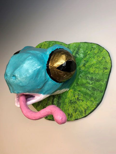
"Litoria Caerulea is the scientific name given to the White Tree Frog, which is the subject matter of my piece. The artwork is a trophy head of said animal but with the scale of the head enlarged. The trophy head is mounted on a lily pad, and the frog has its mouth agape with its bright pink tongue protruding out into the observer’s view. The frog is a natural turquoise and blue with its huge golden eyes. This frog has a coat of glossy finish to add the illusion of the frog being moist. The goal of this project was to help us students as artists to be comfortable in our ability to make our projects proportionate even if we were to make the subject matter much bigger than its original size. With the piece as an artist, I wanted to create an exaggerated but also realistic whit tree frog while keeping all its traits true to the animal. Overall, I believe this artwork was successful in the fact that it is grabs one’s attention in its silliness and ability to brighten up a space while still being true to the actual animal." — Tanner N., Grade 12
Neurographic art by students of Ms. Price
-
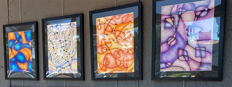
FROM LEFT TO RIGHT: "Ocean Floor" by Kaden K., Grade 9; "Spiral Galaxy" by Harmony W., Grade 10; "Bittersweet" by Ellie P., Grade 9; Purplicious" by Katey C., Grade 11.
-
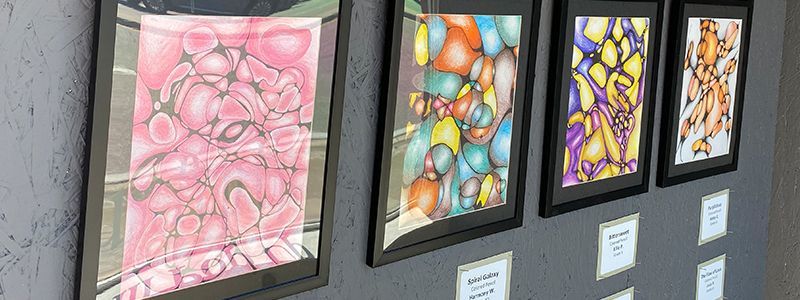
FROM LEFT TO RIGHT: "Bubblegum" by Kayla L., Grade 10; "Untitled" by Yodalis D., Grade 9; "Candlewax" by Ivy L., Grade 10; "The Flow of Lava" by Josie P., Grade 10.
CLICK THE IMAGES BELOW TO READ THE ARTIST STATEMENTS
-
"Ocean Floor"
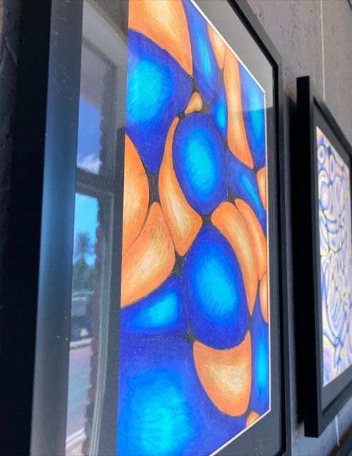
"When I made this piece I used pen, sharpie, and colored pencil. I enjoyed coloring in every circle and bubble because I started off dark and went lighter as I went to the middle. When I started I wanted to do a more under water look with the blue bubbles to orange in between. When making this it was very relaxing because I was doing all the neutral lines so there was no exact way to make it. When coloring in each bubble I took time to put 3 different shades of blue and orange to give the piece depth." — Kaden K., Grade 9
-
"Spiral Galaxy"
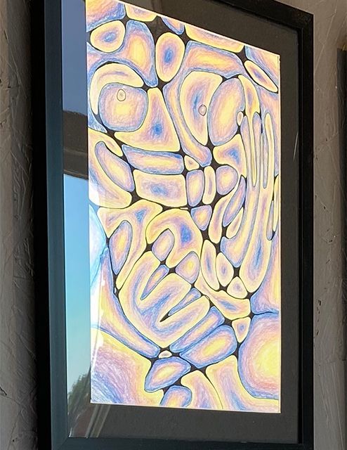
"This is my piece, Spiral Galaxy. I used colored pencils to fill in my neurographic design, colors consisting of indigo, purple, salmon pink, and yellow all transitioning into one another to create a unique pattern. My idea for this artwork was to create a trippy effect by using an alternating color scheme that incorporates both light and dark colors, that you could probably find in a spiral galaxy, hence the name. I hoped to convey the otherworldly feel of a galaxy by translating its color scheme into a more reduced, plasma-like display." — Harmony W., Grade 10
-
"Bittersweet"
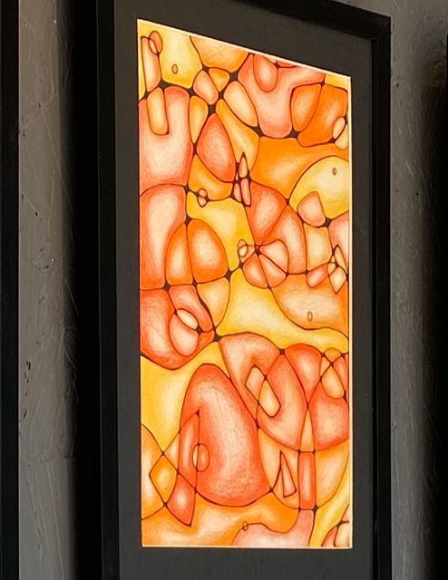
"I used different hues of orange-colored pencils to color and shade in my artwork. I used a pencil to sketch out what I was going to draw, and then used a black pen to outline my sketch. As I was outlining, I made sure to round all the corners in the artwork. After that, I used my orange-colored pencils to shade/color in the darker and lighter areas. I used long, gentle strokes to make my shading as smooth as possible. Working from the edges into the center, I shaded the orb-like shapes to make it look like they are popping out at you. This artwork is more of an abstract piece. There isn’t any set position the “orbs” and lines are in, they are just scattered around the paper. I made this artwork because I think it’s a great way to test out different techniques, especially with the coloring/shading portion. It is also a very relaxing project and requires a lot of patience with the corner rounding. I named this piece “Bittersweet” to resemble the taste of an orange." — Ellie P., Grade 9
-
"Purplicious"
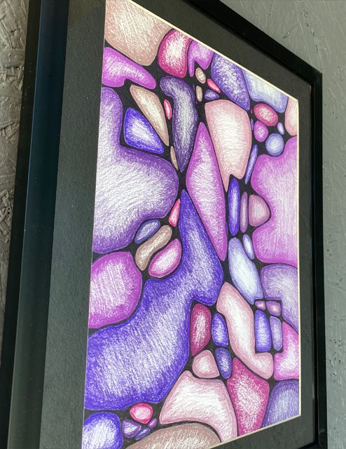
"To create my art, I used a combination of colored pencils and pen. I drew the outlines of the piece in pen and did the rest using a colored pencil, shading the outsides of each shape dark, getting lighter as I worked inwards. I also went for a monochromatic theme, using mostly purples and magentas. The piece consists of different abstract shapes and squiggles to create a put together piece where all the shapes and squiggles meet. Creating the art was enjoyable and somewhat stress relieving, as it provided a distraction. The artwork does not possess a specific meaning, however, it allowed me to express myself and try something new." — Katey C., Grade 11
-
"Bubblegum"
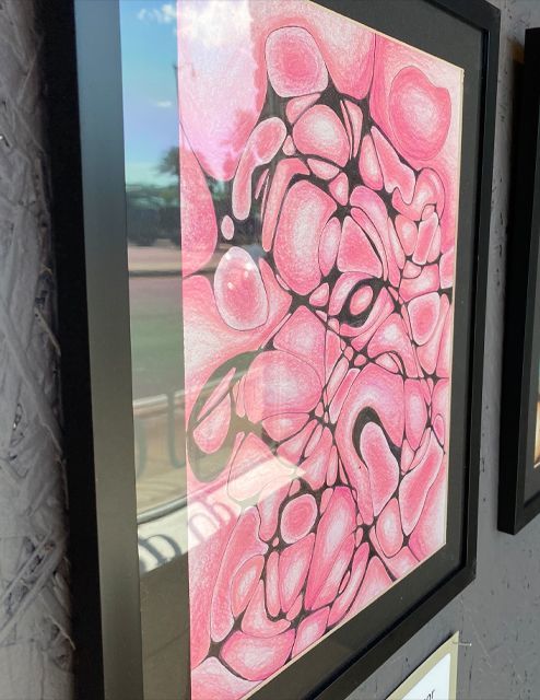
"My piece is title “Bubblegum.” The materials I used for this piece are colored pencils, a thin ballpoint pen, and cardstock paper. The drawing presented is abstract. I didn’t have a clear idea when starting, although, I wanted something vibrant and fun. While looking through an arrangement of colors, pink stood out to me the most. It reminded me of sweet bubblegum because of the pink combination with circular blobs. It also stuck with the theme of vibrancy I was going for." — Kayla L., Grade 10
-
"Untitled"
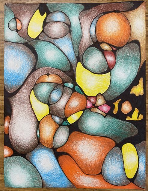
"My piece was made with colored pencils, pen, and marker. I drew the lines and shapes with pen and colored in the shapes with colored pencils. I used shading techniques to make each shape have light to dark values. I varied my colors between greens, blue, oranges, and pinks. I worked slowly and carefully to round each corner off to create the rounded shapes." — Yodalis D., Grade 9
-
"Candlewax"

"The materials I used to create my neurographic art was colored pencils and a thin, ball-point pen. The drawing, being neurographic art, is by nature abstract. I used warm shades of yellow and cool shades of purple. When creating my artwork, I had an idea of how to create my artwork, but I didn’t have any particular theme in mind. The only thing that was clear when I began my artwork was that I was going to use shades of yellow and purple, my favorite colors. Now, looking at the finished product, the theme still isn’t clear. But it does remind me of candle wax, thus the title of my piece." — Ivy L., Grade 10
-
"The Flow of Lava"
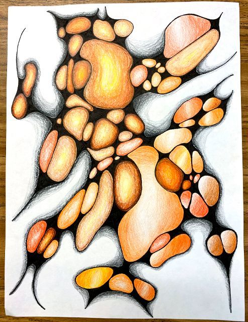
"For this piece I used colored pencils and black pen to create my artwork. I used different shades of orange and added a shadow with a black colored pencil. I used thicker lines and I blended the colors together into an ombre of oranges. I created this to experiment with neurographic art as well as improve my shading and blending. It shows a sense of a strong, yet soft, flow of warmth or power, similar to running lava." — Josie P., Grade 10
Painted frames by students of Ms. Price
CLICK THE IMAGES BELOW TO READ THE ARTIST STATEMENTS
-
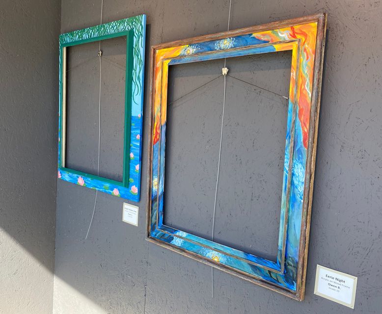
"Kayla’s Water Lilies"
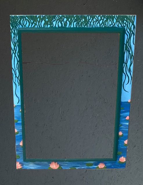
"The story behind my artwork is that I knew I wanted to paint some sort of flower on my frame. I was familiar with Claude Monet’s famous water lily paintings and decided to use these as inspiration for my frame. I decided to create my own water lily painting using elements in the ones he created. I tried to paint in my own way and more realistically. I did learn a few new techniques as a part of the work for this project. I learned how to blend various colors of acrylic paint without mixing them all together into one color when I was painting the water. I learned how to use various shades of colors in order to create lighting and shading on the flowers and vines. The only unexpected turn or mistake I had was that the vines on top looked translucent and messy when I first painted them. I fixed this by painting another layer on top and using another shade of green to cover up any lines I didn’t like as well as to add more dimension. Finally, if I were to do this piece again, I would add more to the background rather than just have a blue sky. I would maybe include some kind of plant just to fill up some more empty space in between the water and the vines. I would also add a little more detail to the empty lily pads." — Kayla L, Grade 10
-
-
"Eerie Night"
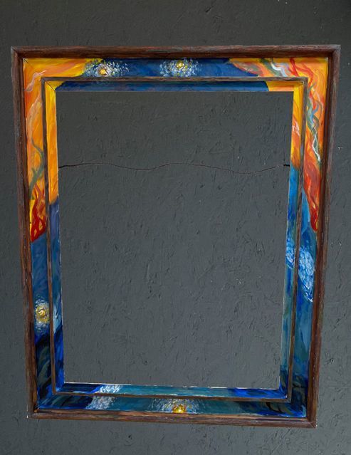
"My artwork is inspired by Edvard munches the scream and Vincent van Gogh's starry night. I chose these two paintings and artists to draw inspiration from because their painting techniques seem very similar. Painting this frame helped me learn how to paint full images with separate strokes. There were many mistakes with the color because when I used one color up it was hard to make a new one exactly the same. If I had to do this frame again I would lay it out better and but the starry night and the scream inspired sections in different places." — Owen B., Grade 10


